I was once asked when looking at one of my completed portraits: "where did you start?" I thought it might be interesting to take a series of images at progressive stages throughout the process and here it is.
Image 1 - The start
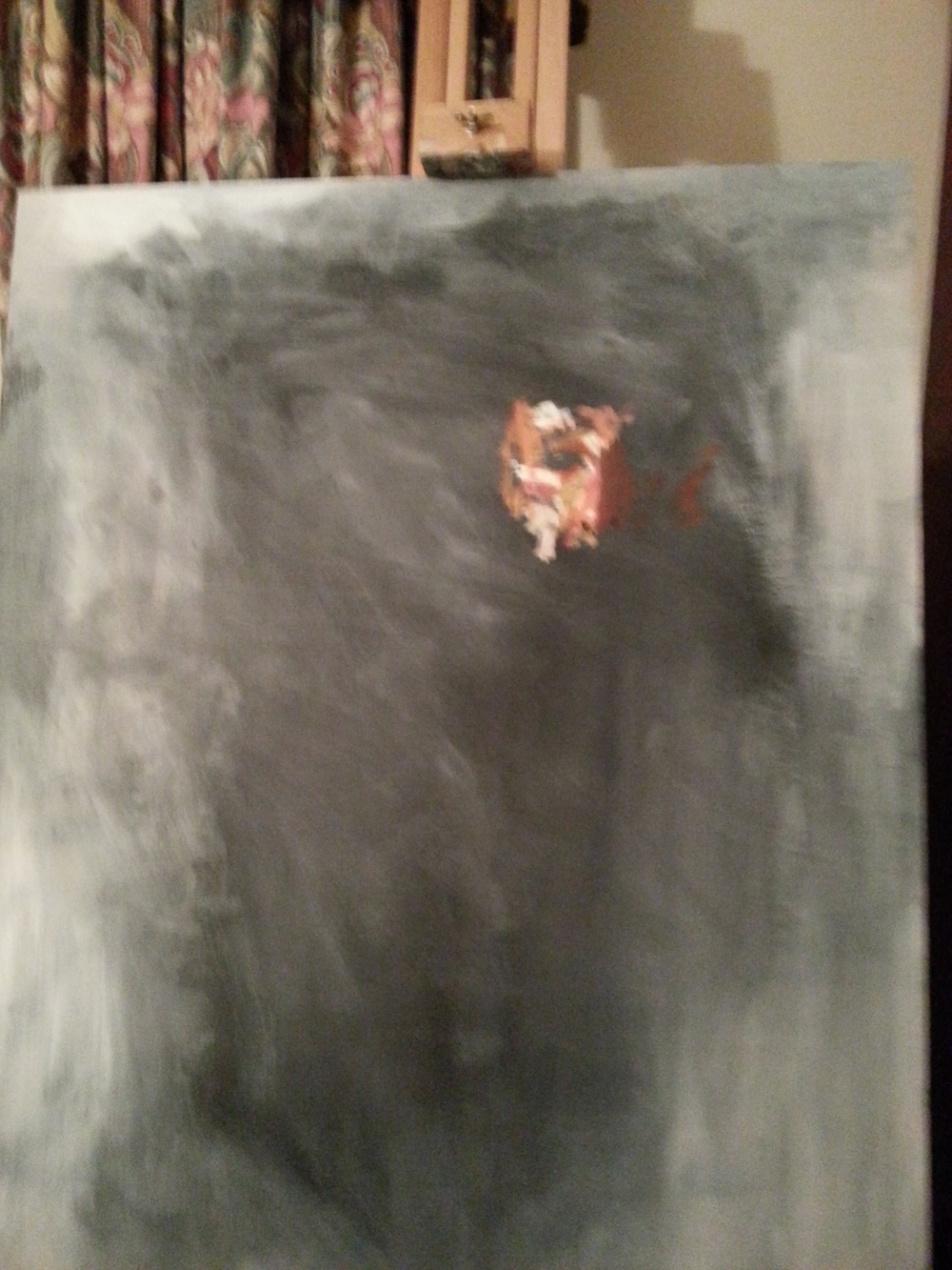
To give myself an idea of how big the face needs to be, relative to the board, I took a soft brush, sparsely loaded with paint, and fleshed out some distinct regions of colour and light around the eyes, cheeks and nose. The result was a rather creepy looking Hollow Man.
Image 2 - Building a proportionate foundation
I sometimes paint details as early as possible in the process to establish a concrete nugget - accurate and proportionate - I then use this as a basis from which the other features, colours etc. can be placed against. It's all relativity! My thinking is, that if I build the regions of the face around a section that is "almost" right, the whole thing can become successively more wonky or disproportionate without knowing - only to find out when the increased details go in - whereas if the nose is self-proportionate, for instance, then the eyes and a lips and cheeks etc. can spread out from this consistent base. The hope is that the subsequent details will be consistent too. Once the collection of eyes, nose, lips have been triangulated and detailed - this collection itself becomes the basis for the rest of the face, hair, neck and clothes.
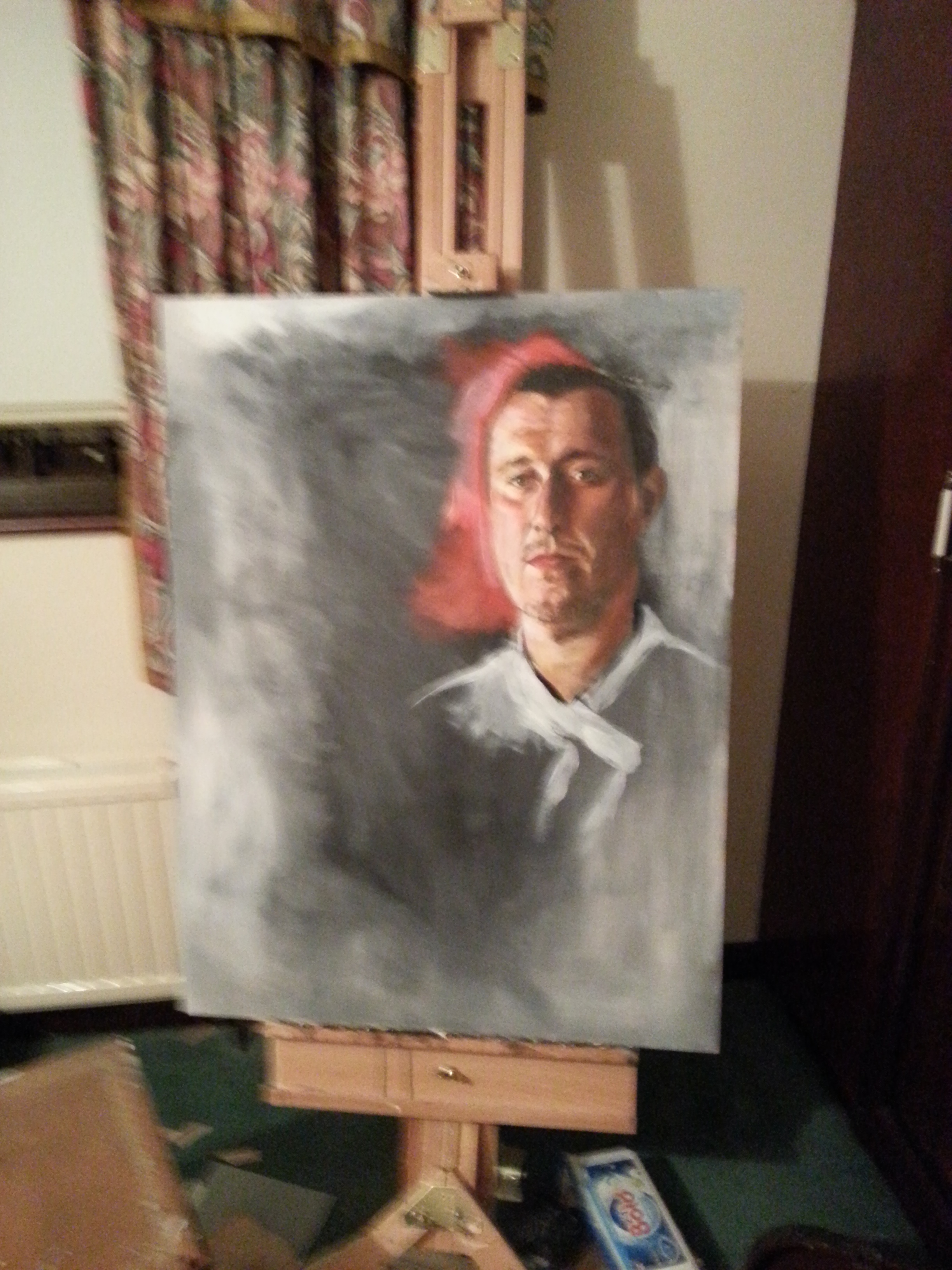
Image 3 - Context & Proportion
I started to add some of the red background to the left of the face - it helps to visualise the boundaries of the face, especially if the hair is black and the background is dark. I try never to allow the potential for illusion when there is something that can done. Isolating specific features is essential when painting, but difficult, and it is impossible to judge whether your depiction is successful without applying some colour and detail to the surrounding areas that provide vital context. Some embryonic work has started on his chef uniform here too, for the same reason as the red: context and proportion.
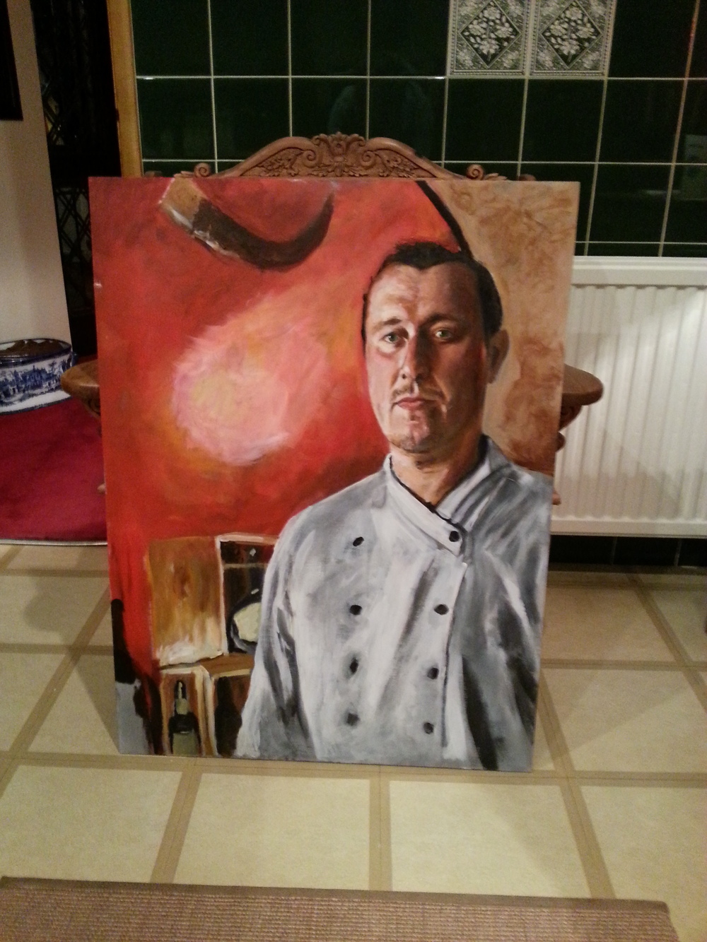
Image 4 - Fleshing out the background
I seldom paint backgrounds slowly or with an infusion of excess detail. Why detract from the main image, the focal point? We live in the world of camera's now, so detail chases the unachievable. I find with this method, however, that the wobble, the impressionistic aspect of the background adds life, passion and excitement. The transition from image 3 to image 4 took me no more that 40 mins - but it's over 60% of the board itself. The whole painting took about 12 hours over two days. Unfortunately, I tried to add more detail face when I was feeling under weather one evening, and lost it. Gone. Caput. Consigned to the bin. Lesson: sometimes, less is more - and never paint when feeling ill!
